Dashboard Tips & Best Practice
In general, there are no rules on how to structure or use dashboards. However, the following sections covers some best practices and ways of avoiding common pitfalls.
Create Multiple Dashboards
The IXOPAY platform supports multiple dashboards. This allows you to create dashboards for different purposes by leveraging global filters.
For example, you can set up one dashboard for monitoring your overall sales statistics (successful transactions of the type authorize and debit), another fraud related dashboard for monitoring the chargeback rate of credit cards, another dashboard for monitoring transactions for one of your key customers, etc.
Try to avoid creating giant dashboards with dozens of widgets, covering all aspects of your company. Important KPIs may get lost in the clutter and performance may suffer due to the number of widgets.
Override Global Filters Carefully
One common mistake is overriding global filters extensively. While there are valid reasons for doing so, overriding global filters can come with a range of disadvantages.
- The data in individual widgets will no longer allow for meaningful comparisons if each widget it displaying data over different time ranges, methods and transaction types.
- Editing the global filter once and seeing the changes reflect by the entire dashboard is more convenient than editing each widget individually.
Instead of overriding global filters, try to group widgets with common filters in their own dashboard.
Change Widget Titles
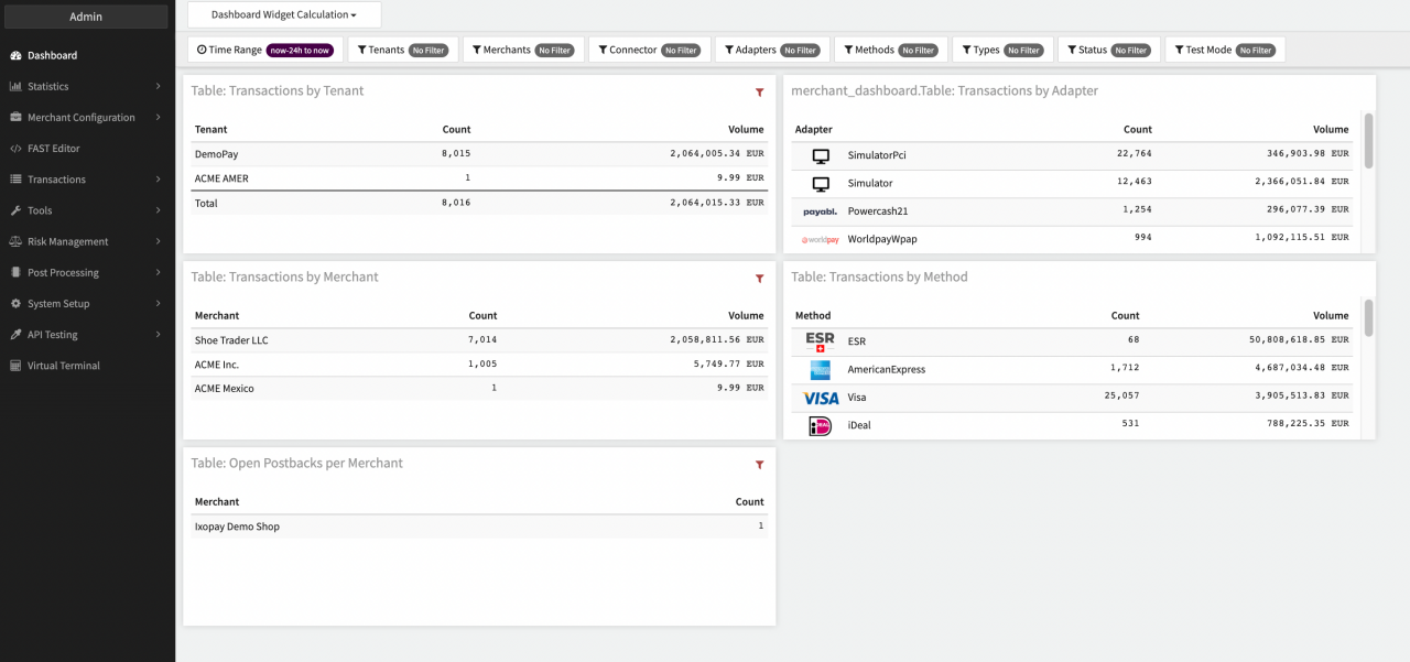
When adding a widget, we recommend renaming the widget to something meaningful. This clearly communicates what the widget is visualizing. Short names are sufficient ("Top Merchants", "Top Methods", "Total Tx Today"), but adding information about any applied filters too ("Success Tx Count 30 Days", "Chargeback Rate - Current Week", "Failed Tx Today") may be helpful. Users should not need to guess what a widget is displaying - meaningful names will save them from having to investigate the applied filters.
Share Dashboards Templates with your Team
Multiple users are often interested in the same report (sales, chargeback rate, decline rate etc.) Rather than have each user set up their own dashboards, which is cumbersome and error-prone, define common enterprise-wide dashboards and make them accessible to your colleagues. These dashboards can be altered anytime (if the user has the necessary permissions) and any changes are visible to all users. Users can also clone shared dashboards and modify them for their own purposes.
Calculation Algorithms
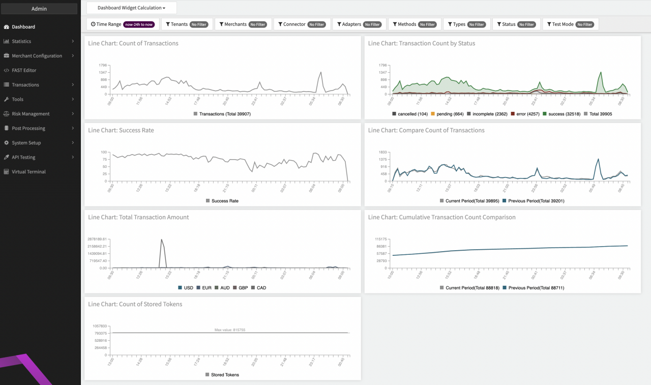
Trends
Trend Widgets indicate the development of a rate, count or amount of transactions of specific type or state in the configured period. The rate/amount is calculated therefore using the count/total amount of transactions of the specified type or state divided by the count of captured transactions (debit/capture). Count simply counts the transaction of a specific type or state.
Take for example the Compare Chargeback Rate:
The arrow indicates the Trend of the rate in the configured period and compares it to the previous configured period (e.g. if you view the dashboard for the last month, it compares the same figure with the previous month). If the chargeback rate is higher than in the previous period, the arrow will become red, if it decreases, it will become green to indicate negative respective positive development. The rate is calculated by dividing the count of chargebacks by the count of debit/capture transactions (captured transactions).
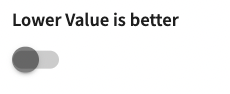
The color coding of arrows can be configured in the dashboard widget (Lower value is better)
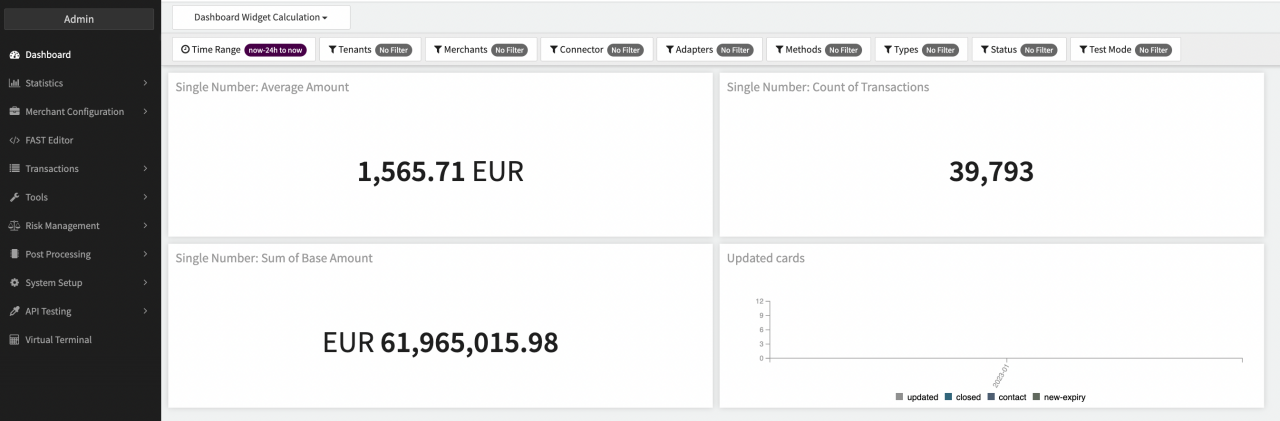
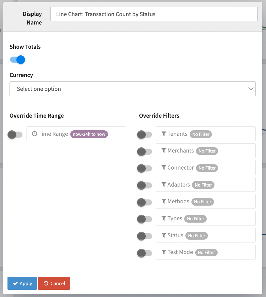
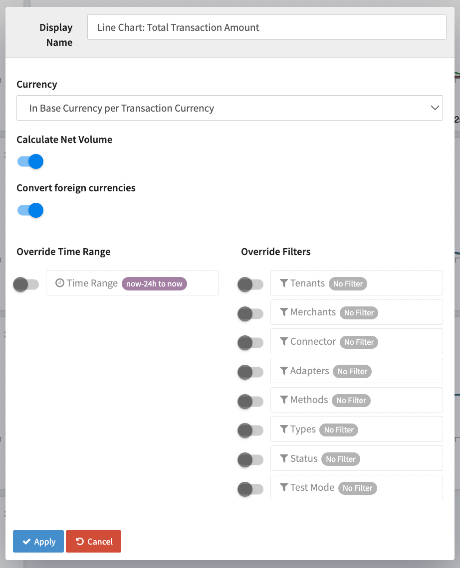
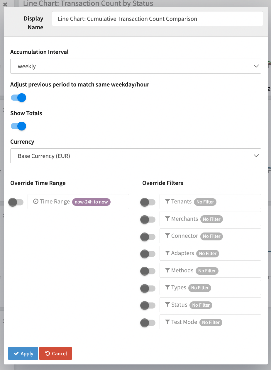
Line Charts and Single Numbers
Depending on the chosen Single Number or Line Chart you have different options to customize the Dashboard Widget to optimize the information.
- Show Totals to include the total number in the Widgets legend
- Calculate Net Volume and Convert foreign currencies
- Accumulation Interval and Adjust previous period to match same weekday/hour
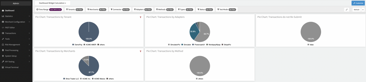
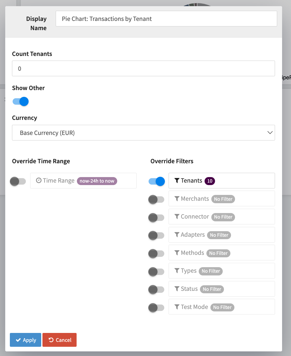
Pie Chart
For Pie Chart you have different options to customize the Dashboard Widget to optimize the information.
- Count * (to limit the number of segments) and Show Other
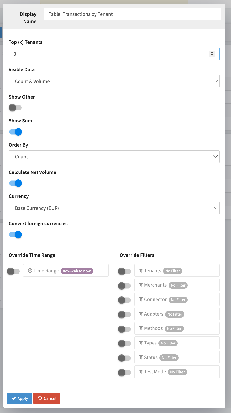
Table
For Table Charts you have different options to customize the Dashboard Widget to optimize the information.
- Top (x) Merchants
- Visible Data - Count&Volume, Only Count, Only Volume
- Show Other and Show Sum
- Order by - Count, Volume
- Calculate Net Volume and Convert foreign currencies
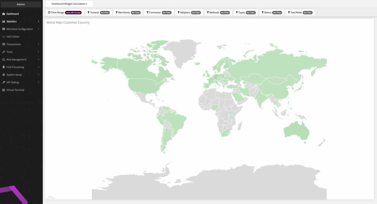
World Map
For World Map you have the option to customize the Dashboard Widget to optimize the information by selecting which country should be displayed - Billing country or card country.